Stichting Lezen en Schrijven

“A strong and exemplary branding, which actively approaches those with literacy problems, thereby making a relevant contribution to society.”
Awards
-
1×
-
1×

-
1×
-
1×

-
1×

Challenge
One in five European adults struggles with reading and writing. They face daily obstacles that make it harder to participate in modern society, leading to social and economic exclusion. This is both morally and economically unacceptable.
Stichting Lezen en Schrijven works to prevent and reduce low literacy in the Netherlands and beyond. Yet the organisation’s outdated identity no longer reflected its mission: making language accessible to everyone.
The challenge for TD: create a clear, warm, and inclusive brand identity that makes the foundation recognisable to a broad audience and strengthens its social impact.
Idea
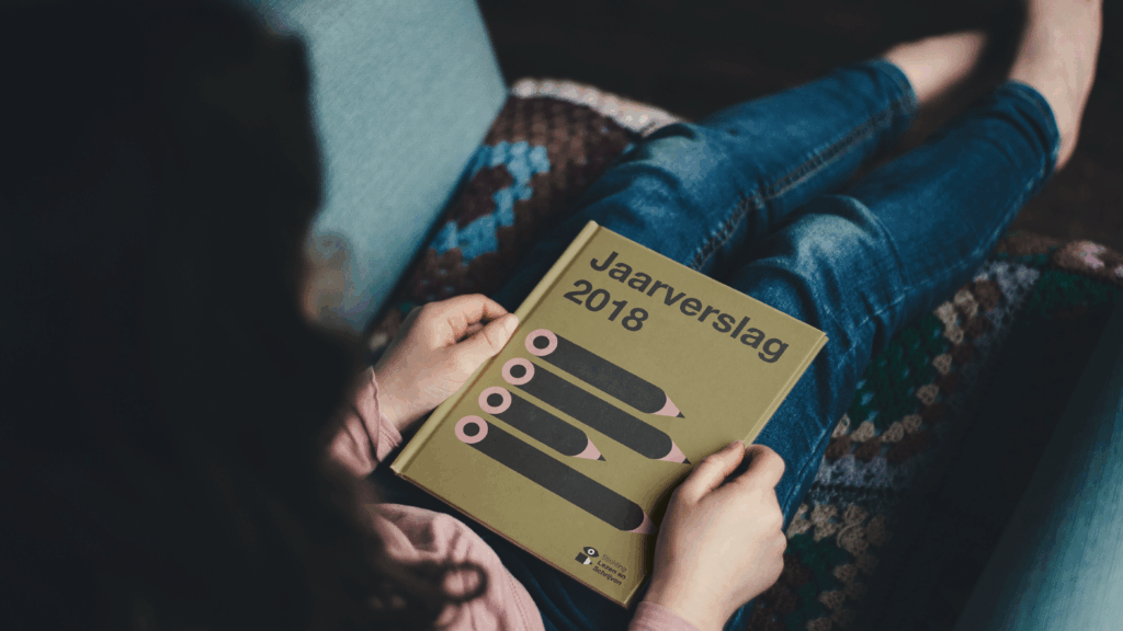
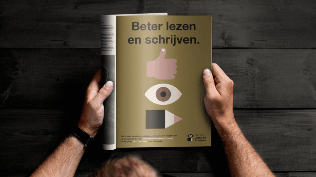
Accessibility was the guiding principle in every design decision, from colour contrast to typography, from tone of voice to imagery. TD created a contemporary, accessible visual identity that radiates empathy and clarity.
The new branding combines humanity with simplicity: legible typefaces, strong contrasts, and distinctive illustrations make complex issues easy to understand.
In addition, TD developed a flexible brand system with practical tools, templates, and guidelines. This enables employees, municipalities, and partners to communicate quickly, consistently, and inclusively online, in print, and through campaigns.
Result
The new identity has helped Stichting Lezen en Schrijven express its mission more powerfully. Since its introduction, brand awareness has increased by 5% and theme awareness by 8% (2019–2022).
The design system improves internal efficiency and strengthens external recognition, from municipal collaborations to national campaigns such as Ik wil leren and the Week van Lezen en Schrijven.
Today, the foundation speaks with one accessible, human voice, paving the way for a society in which everyone can participate.
In 2020, ING introduced its new strategic positioning with the tagline ‘do your thing’. The bank steps back from the stereotype of a traditional institution. People’s lives don’t revolve around finance. They revolve around opportunity, possibility, and the freedom to shape your life on your own terms. ING is there to help you make the most of that.
A trained eye
Keeping ING’s global image library growing requires a close working relationship. Finding images that convey exactly the right feeling demands a trained eye and a well-orchestrated process. Together with ING Global and their international markets, we ensure a subtly different look and feel for the cultures and lifestyles of each market in which ING operates.
Alongside online searches, we also produce bespoke content. The challenge, each time, is to capture that “lucky shot” feeling. Our in-house photographer, working alongside selected photographers in local markets, knows precisely how to get the right picture.


A high brand standard does not stop at photography. ING’s new global brand direction needs to resonate throughout the entire brand experience. Our task is to develop the brand and visual identity on an ongoing basis, working alongside ING’s international and local experts. Throughout the year, we run sessions to sharpen the current visual identity and guidelines.
A high brand standard does not stop at photography. ING’s new global brand direction needs to resonate throughout the entire brand experience. Our task is to develop the brand and visual identity on an ongoing basis, working alongside ING’s international and local experts. Throughout the year, we run sessions to sharpen the current visual identity and guidelines.
A high brand standard does not stop at photography. ING’s new global brand direction needs to resonate throughout the entire brand experience. Our task is to develop the brand and visual identity on an ongoing basis, working alongside ING’s international and local experts. Throughout the year, we run sessions to sharpen the current visual identity and guidelines.

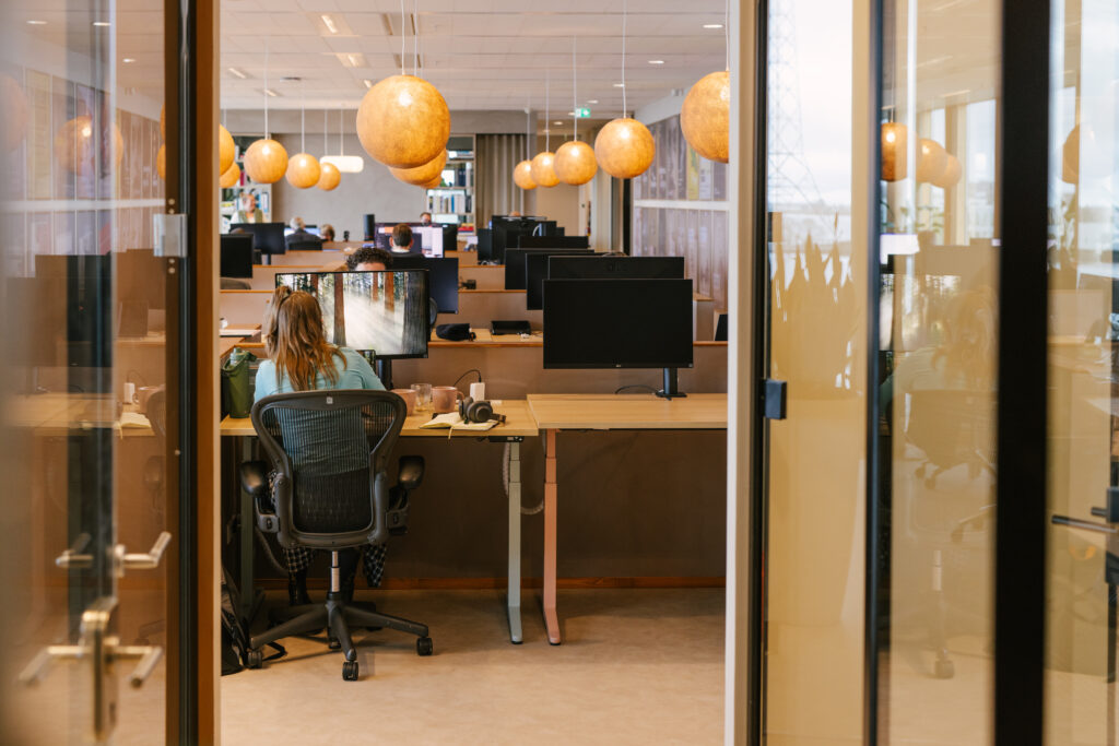
ING wanted to move away from banking clichés: less corporate, more human. Total Design defined a new photography style built on authentic, spontaneous moments. Real people, real emotion. The resulting global library of 5,000+ images works across markets and cultures — consistent, adaptable, and distinctly un-bank-like.
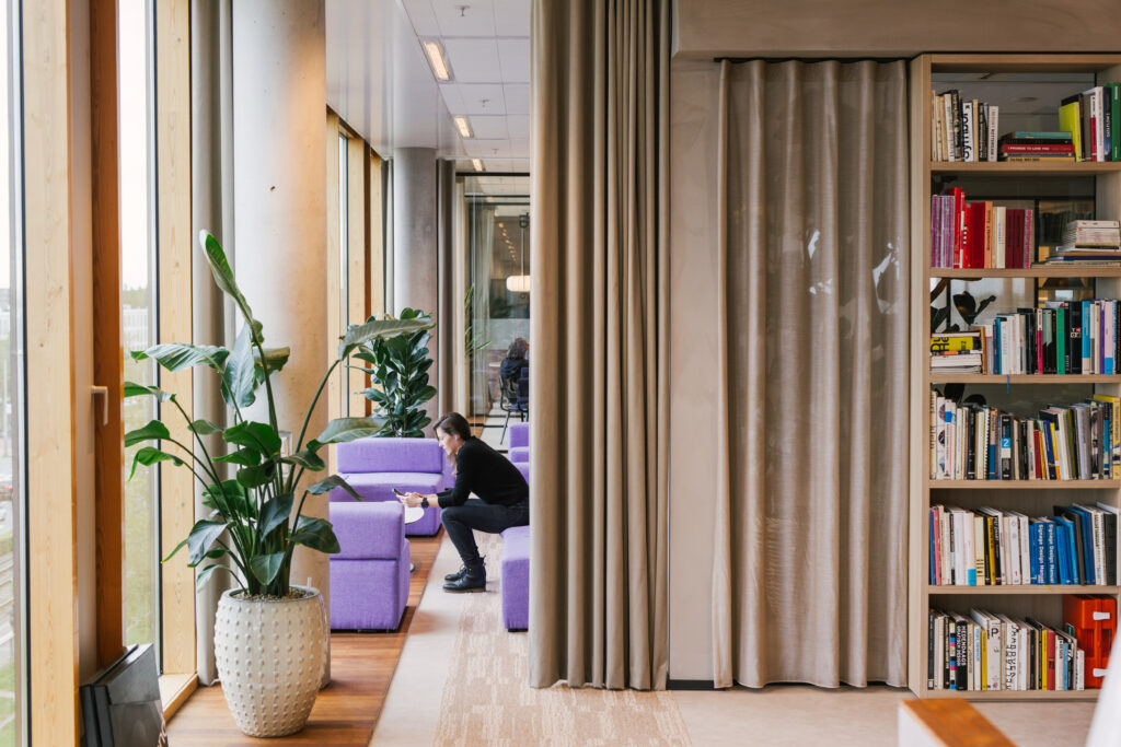
ING wanted to move away from banking clichés: less corporate, more human. Total Design defined a new photography style built on authentic, spontaneous moments. Real people, real emotion. The resulting global library of 5,000+ images works across markets and cultures — consistent, adaptable, and distinctly un-bank-like.
Contact